Developer.intuit.com is a platform for third-party developers to develop applications that integrate with Intuit’s products such as QuickBooks or Turbo Tax. These applications can be found on Apps.com (owned by Intuit) or within each product. In 2017, Intuit aimed to reimagine the developers’ experience in building apps as a long term partnership.
Disclaimer: This write-up is meant to describe my process. I have omitted confidential information and actual data. The information in this case study is from my own perspective and does not necessarily reflect the views of Intuit.
Why I show this work
I joined this project as a sole designer while working on 3 other projects with multiple Product Managers due to the organization's structure at that time. I was able to manage, prioritize, execute and deliver the key parts for each project until I got more help to fully focus on this Intuit Developer project.
Strategic execution
I led the project with user empathy approach to solve the lack of pre-existing insights which caused misalignment among stakeholders.
Concrete data feedback and rapid hypothesis tests were used as the main navigator for the project direction. As a result, Net Promoter Score increased by 29 points.
I also received a patent for an innovative feature that I designed while observing how developers use the Sandbox & API Explorer tool.
Collaboration
- This platform involved countless global stakeholders and diverse types of developers, through “Design for Delight” sessions, I was able to align teams on the ideal vision, product roadmap, and roll-out phases to move forward synchronously. The stakeholders included but not limited to Product Managers from different pillars of the ecosystem, engineers, marketing, developer relation, developer support, technical writer, design system, APIs team.
Problem solving at scale
- One designer couldn't do it all within the time frame, I divided the problems into multiple tracks and leveraged established experts and patterns for each one.
- As the sole designer with thousands of pages to create and redesign, I created a dynamic design framework that can be applied across the platform with help from the design system visual designer.
Business challenges
From qualitative and quantitive feedbacks, we knew this platform needed a lot of love and care in order for developers to love it.
- NPS
The NPS (Net Promoter Score) and PRS (Product Referred Score) were the lowest compared to other products.
?
Misalignment across teams due to the lack of research and data.
$$$
The high cost of support was conflicted with the results we were getting.
Initial approaches
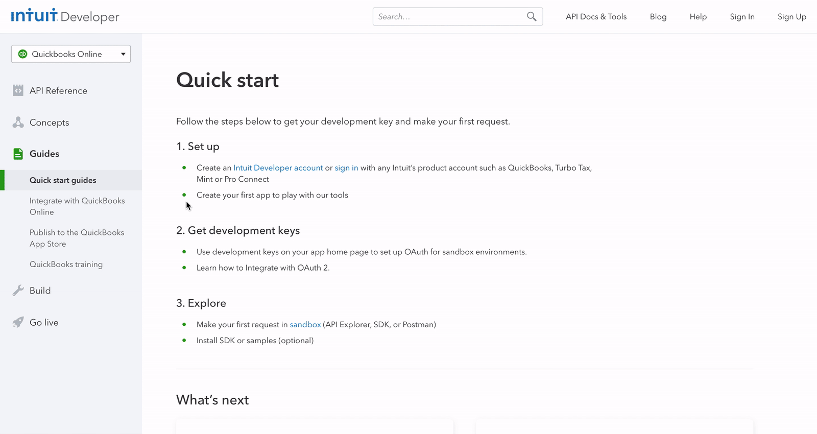
Coming into this new product field where I was not familiar with developer technical workflow, I spent all the extra time to learn more about developers. I did a series of rapid interviews and “follow me home” sessions where I observed developers at their workplace. I then identified the common behaviours and mapped out their journey.
Journey of developers

1. Explore and learn
Developers play with the APIs & tools to understand how things work.

2. Build
Once they have basic knowledge, they build their app with our tools.

3. Publish
After finish building their app, they release it for private use or list it on the QuickBooks app store.

4. Manage
Developers view analytics, app reviews, user connections, and manage their published app.
Current state
“ It’s difficult to find what you are looking for. I had to do a lot of google searching in addition to the developer info to figure out how I needed to integrate.”
The Product Manager and I interviewed developers who gave us low rating feedback to get a deeper understanding of the challenges developers were facing with our platform.
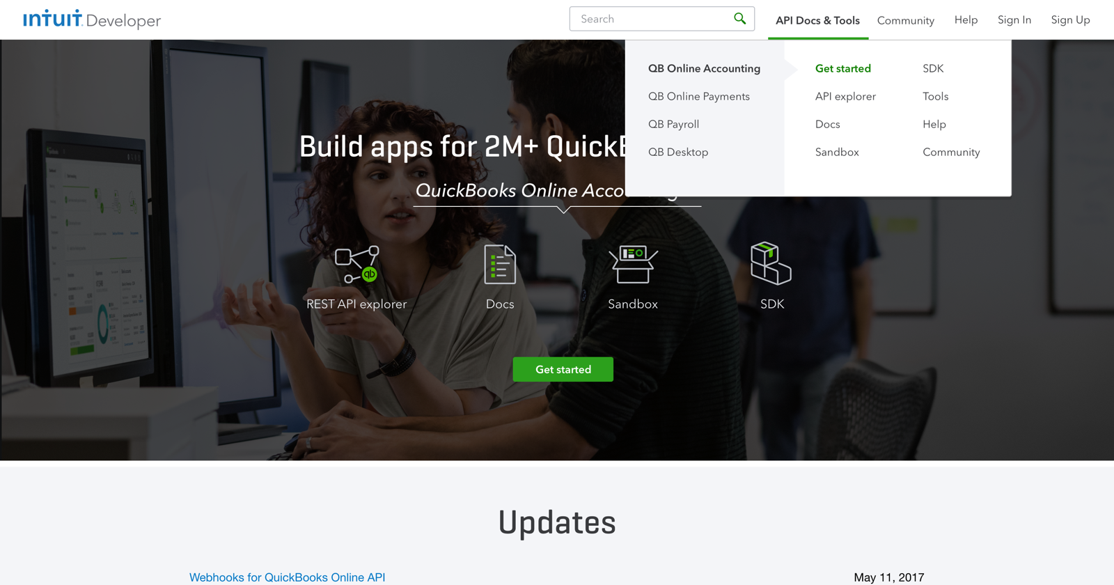
- The old website was marketing-centric.
- Developers did not have a defined path to get to the resources they wanted.
- The publishing process was lengthy with unexpected issues. It was a lot of back and forth support team because not all the requirements are listed upfront. Developers had no clear estimation of the timeline, which negatively impacted their product launch and marketing plan.
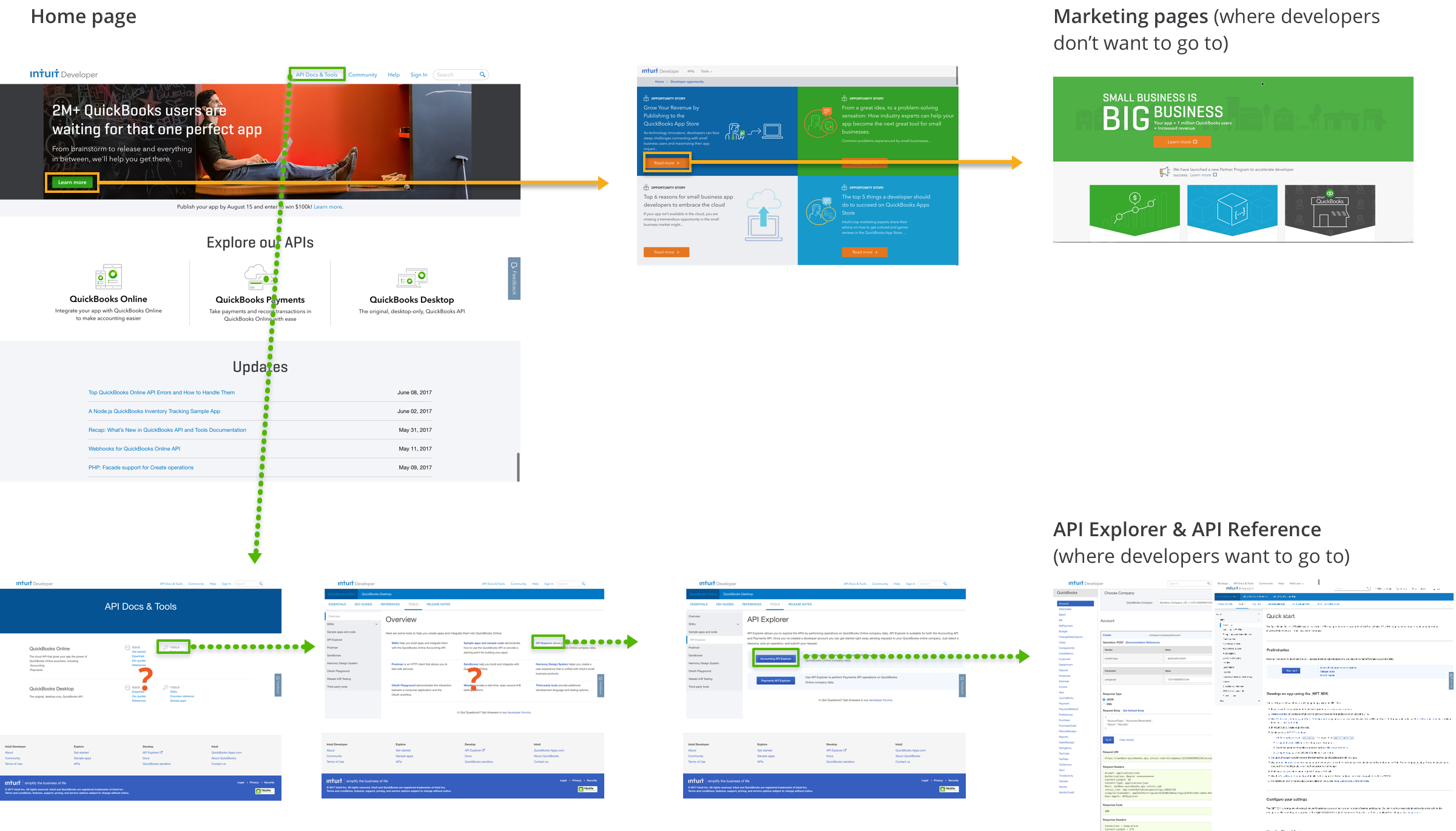
Screenshots flow from the home page CTA which leads to marketing pages where developers don't want to go while it takes many uneasy steps to get to where they want.
Other platforms
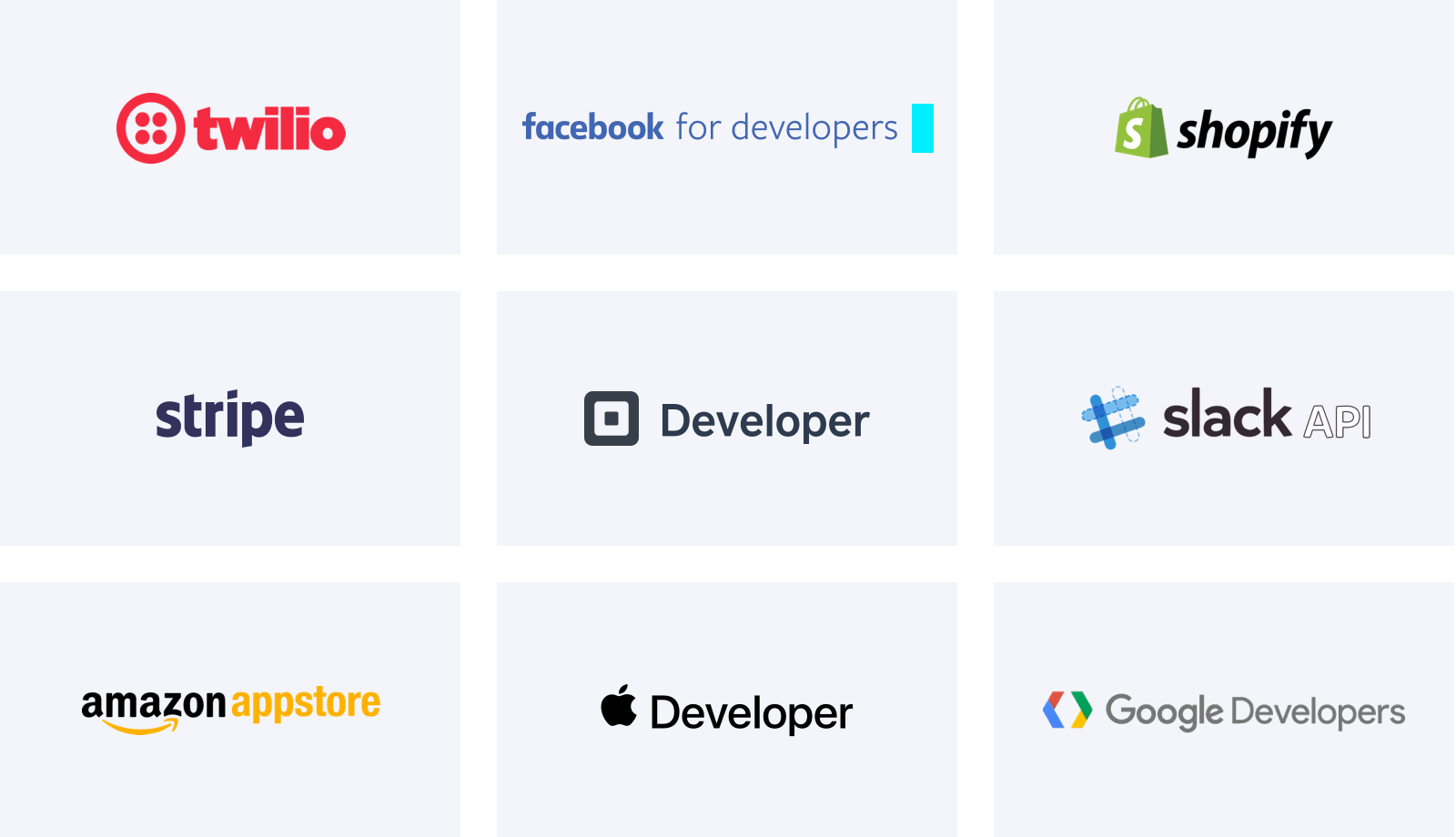
To learn about developers’ expectation and what great experience looks like, we studied the top platforms on strategies of first-time use path, account onboarding, user goals, documentation layout, app creation and publishing process.
More than 90% of developers gave a good rating to 2 platforms in our survey. One has a personalization approach based on development language and features.
One platform stands out with their interactive widgets to help developer easily learn and follow the requirements.
Another platform has great feedbacks from developers with clear guidance and a detailed checklist on how to list the app on their app store.
Digging into the “why”
Now we had a high-level understanding of where things went wrong, but we still didn’t know what went wrong due to the lack of research and data before I joined. This also caused stakeholders were not aligned on the same problem.
Learn by failing
At Intuit, we encourage failure to discover success. The idea is to experiment our way out by making a lot of mistakes and keep the cost extremely low. With the initial learning in mind, I created a few concepts to test our “What if”s on top of the current website and set success metrics for each one.
What if developers choose the platforms and/or language they develop in. The information would be personalized to their choices.
What if developers could better be prepared by knowing all the information upfront through a high-level journey map so there would not be any surprises.
Listen to understand
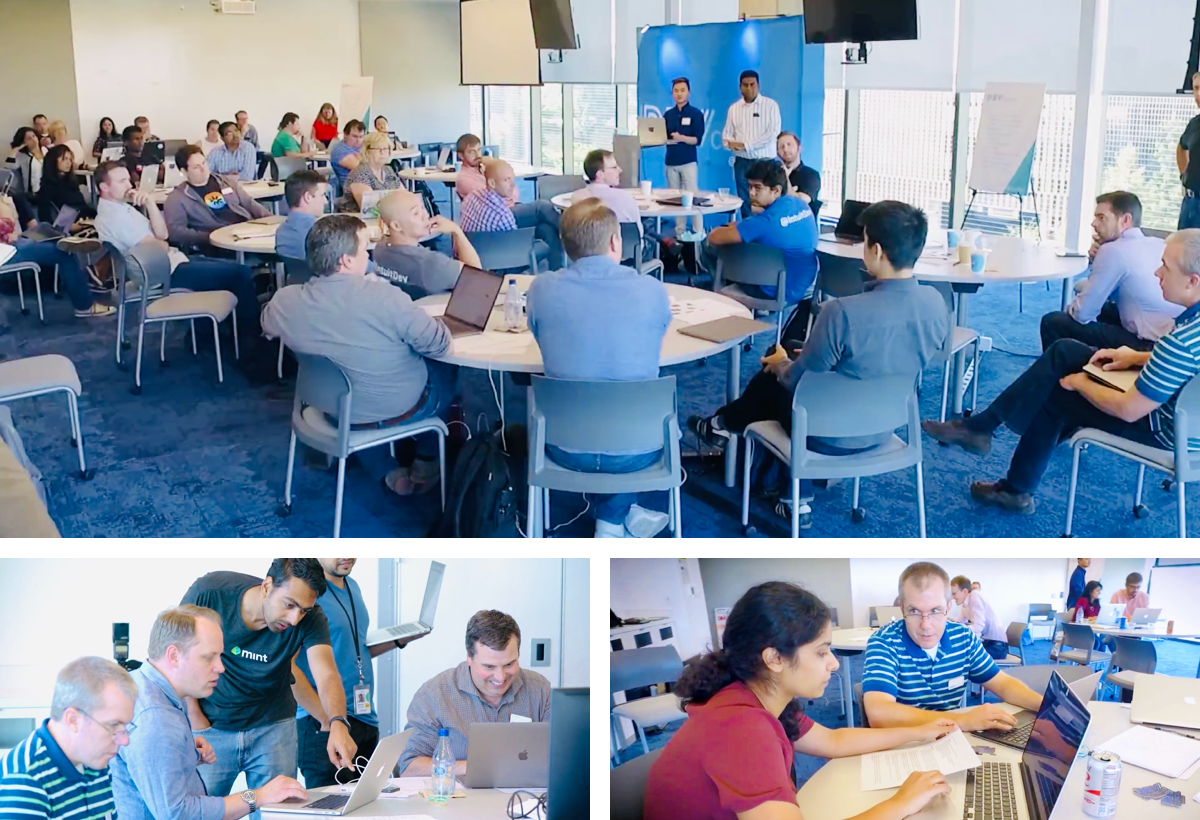
To observe real behaviors and get raw feedbacks for our assumptions, I leveraged the Developer Council, where developers from the top apps of our platform come and play with our early features.
Before the event, I trained 12 facilitators from stakeholder teams to conduct and record 1:1 user testing session. This gave them a chance to feel the painpoints of developers as well as scaling myself from a sole designer to leverage more help. 
Identify opportunities
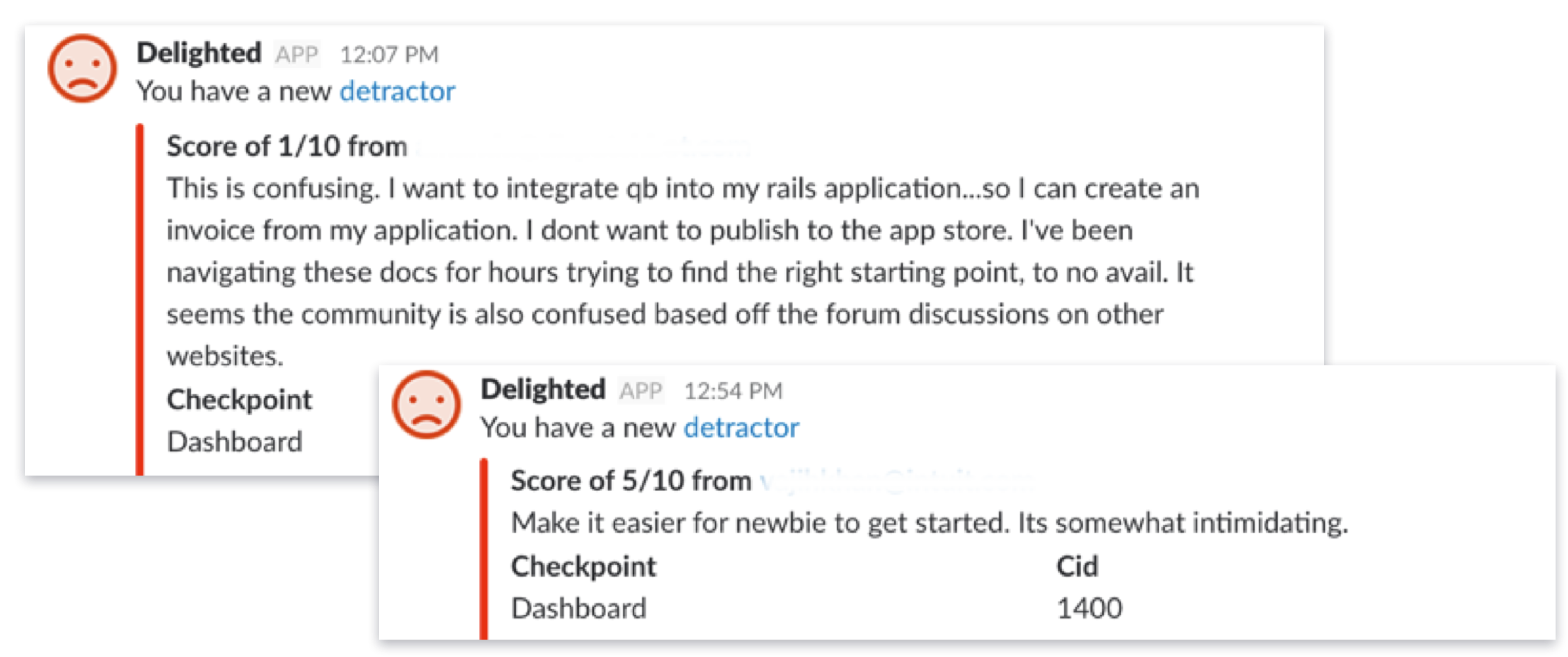
From all the recorded videos and round table notes, I documented the feedback and created a feedback heat map to give the team a holistic understanding of what is going. This helped all stakeholders to be involved in the learning and discovery process.
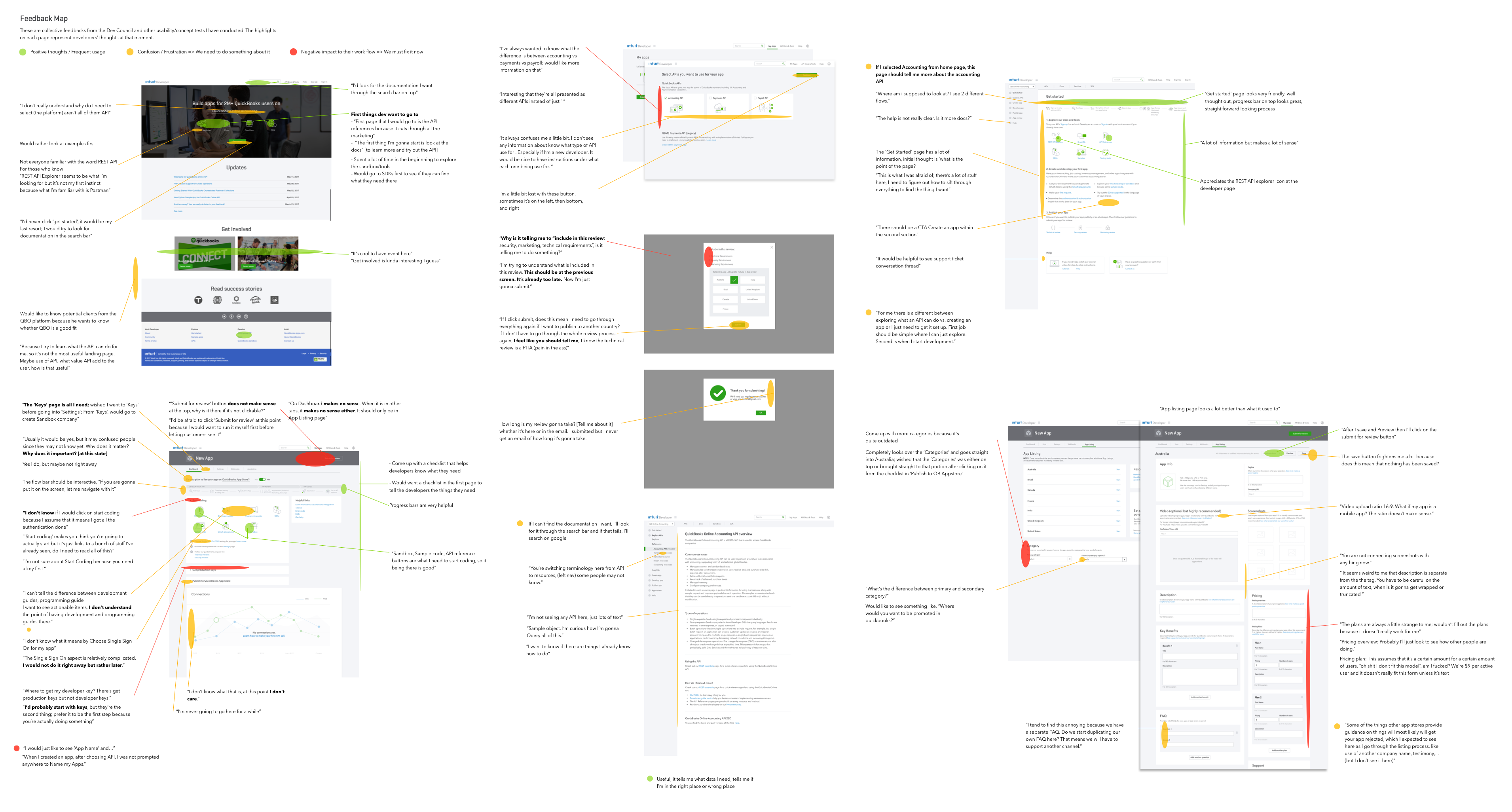
Feedback heat map of the key screens in the end-to-end experience from first-time exploring resources to submitting the app.
With the feedback heat map, we learned that some of our hypotheses were not effective, such as the personalization approach. There were some promising ideas we should continue developing like our journey-based left navigation. Some summary of key takeaways:
Every developer has different ways to get started.
The overall experience should not reflect a linear process, as it’s usually not, and commonly has many dead ends and long pauses.
API naming convention, terminologies, and development environments are confusing and not clearly distinguished.
Developers are not accountants. They don’t know how QuickBooks works or how accounting works.
“It seems like we really didn’t know anything about our users until now.”
The defining moment
Team alignment
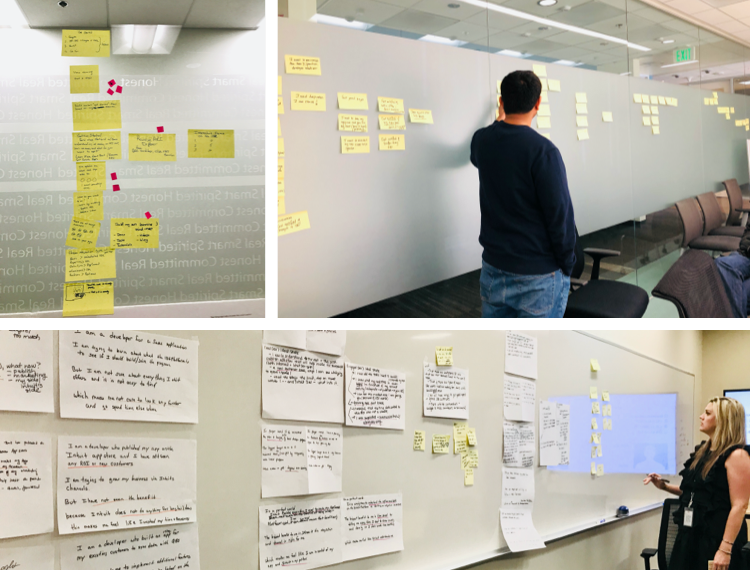
To align on the problem, I organized multiples Design for Delight sprints to help all stakeholders understand better about our developers. They all had opportunities to deep dive and contribute to the direction.
Customer empathy
How do we create something that works for all types of personas in all situations?

I’m a third-party developer.
Task focus: I need to start integration with QuickBooks through my exiting app.
Workflow: Read the API references doc, play with the APIs, create an account, create an app, get development key, start the integration.
Questions: How easy is it to integrate with QB? How does QuickBooks work?
Delight moment: Make the first API call and get the development keys

I’m a freelance developer
Task focus: I want to use QuickBooks resources to build an app for my client
Workflow: Get an overview of the requirements, download SDK and explore it with Postman, read the docs if something doesn’t work
Questions: How does QuickBooks work? How does accounting work?
Delight moment: understand QuickBooks resources to use them confidently

I’m a product manager
Task focus: I need to increase connections to exceed revenue goals
Workflow: understand my current connections data and the areas that affect conversion, look for resources that could help fix these areas
Questions: What are some resources or tools that QuickBooks can help me promote my app to be seen by a good amount of QuickBooks users?
Delight moment: see an increase in connections and conversions

I’m a marketer/sales/customer success
Task focus: I need to prepare for the launch of my company app
Workflow: find what marketing information does QuickBooks need to list on QuickBooks App Store, draft, review
Questions: What is QuickBooks App Store? Is there a specific list I can follow to make sure I don’t miss any information?
Delight moment: feel confident that I present the app with the right contents that help the app stands out from the competitors and drive connections.
Reframing the problem
Developers often feel lost because they can’t easily find the resources they need and don’t know where to start. At the same time, they have a hard time understanding the resources because they don’t know how QuickBooks or accounting works.
Setting an ideal state
Developers can quickly get to the resources they need in one click with a clear path and guidance. They can learn more about QuickBooks and accounting along the way, so they have confidence in building their app, and feel like Intuit understands developers' needs.
Introducing
The new Intuit Developer
From the problem statement and ideal state, our directions boiled down to the main purpose is to give developers quick access to what they need and guidance along the way.
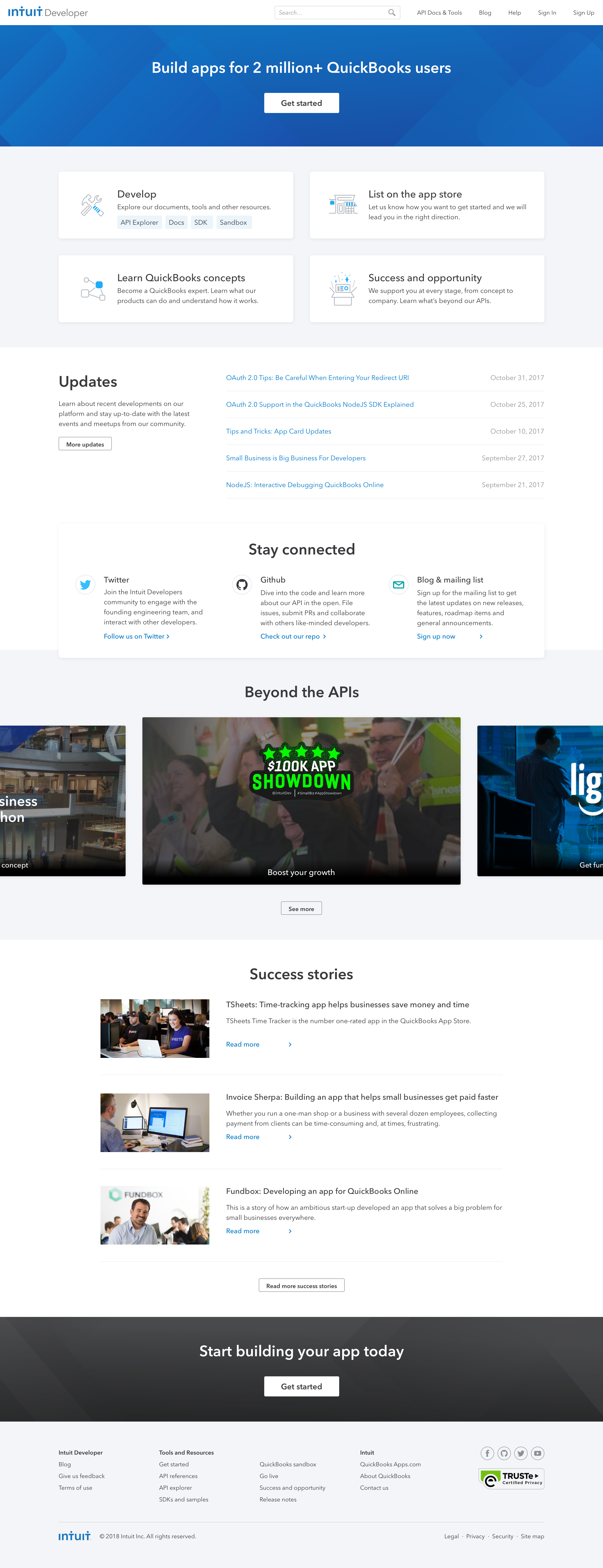
Quick access
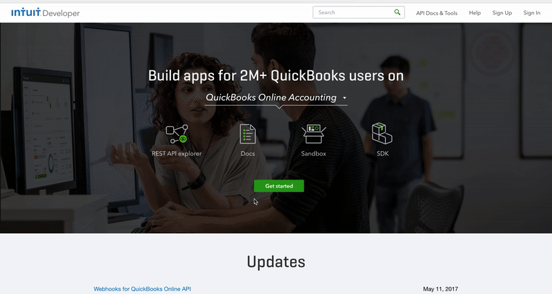
Once landed on the home page, developers, product managers, or marketers can easily access key resources within one click regardless of their tasks.
Develop card is for developers who want to quickly get their hands dirty with our resources. With the highlighted pill links, they can click on the resources they want to start first.
Concept card teaches Developers more about common use cases in QuickBooks so they can see where their app fits in.
Develop card is for developers who want to quickly get their hands dirty with our resources. With the highlighted pill links, they can click on the resources they want to start first.
Success & opportunity card provides marketing resources to product managers, CEO, marketers, and Success and Opportunity teams.
Easy navigation through the journey
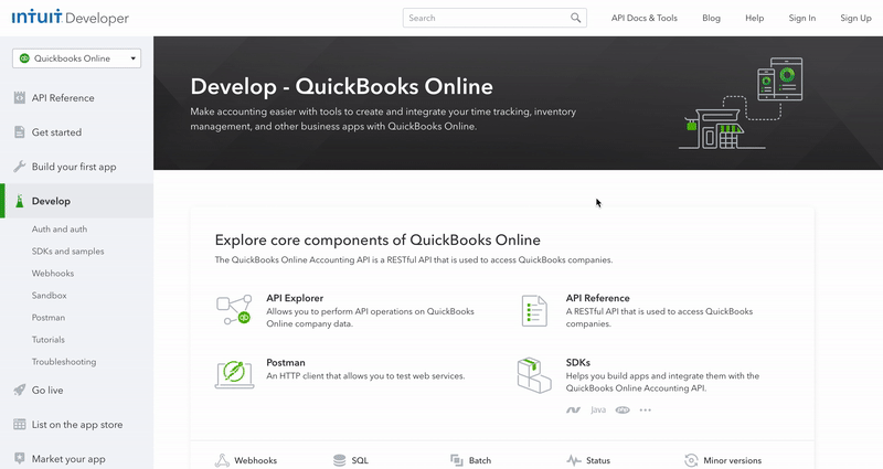
Documentations are organized as a journey from top to bottom that gives developers a high-level overview and instructs them where to go next.
This took us a separate project to audit all thousands of our documentations, rewrite, and reorganize them.
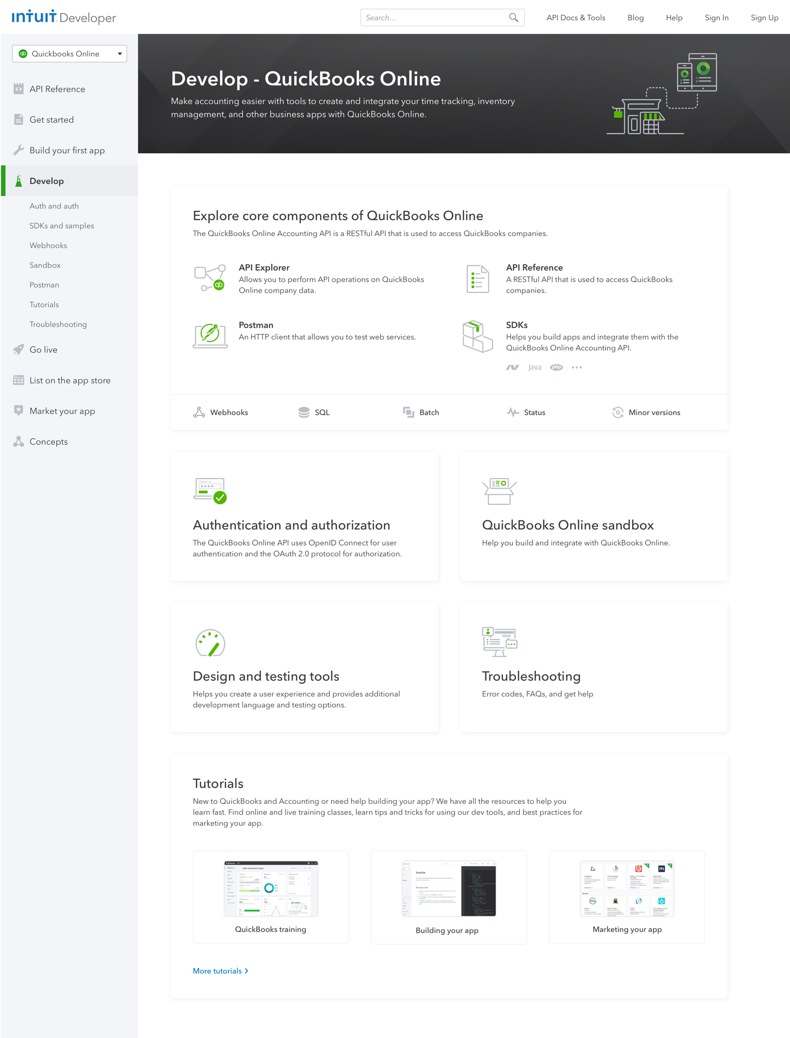
Know where they are and where's next
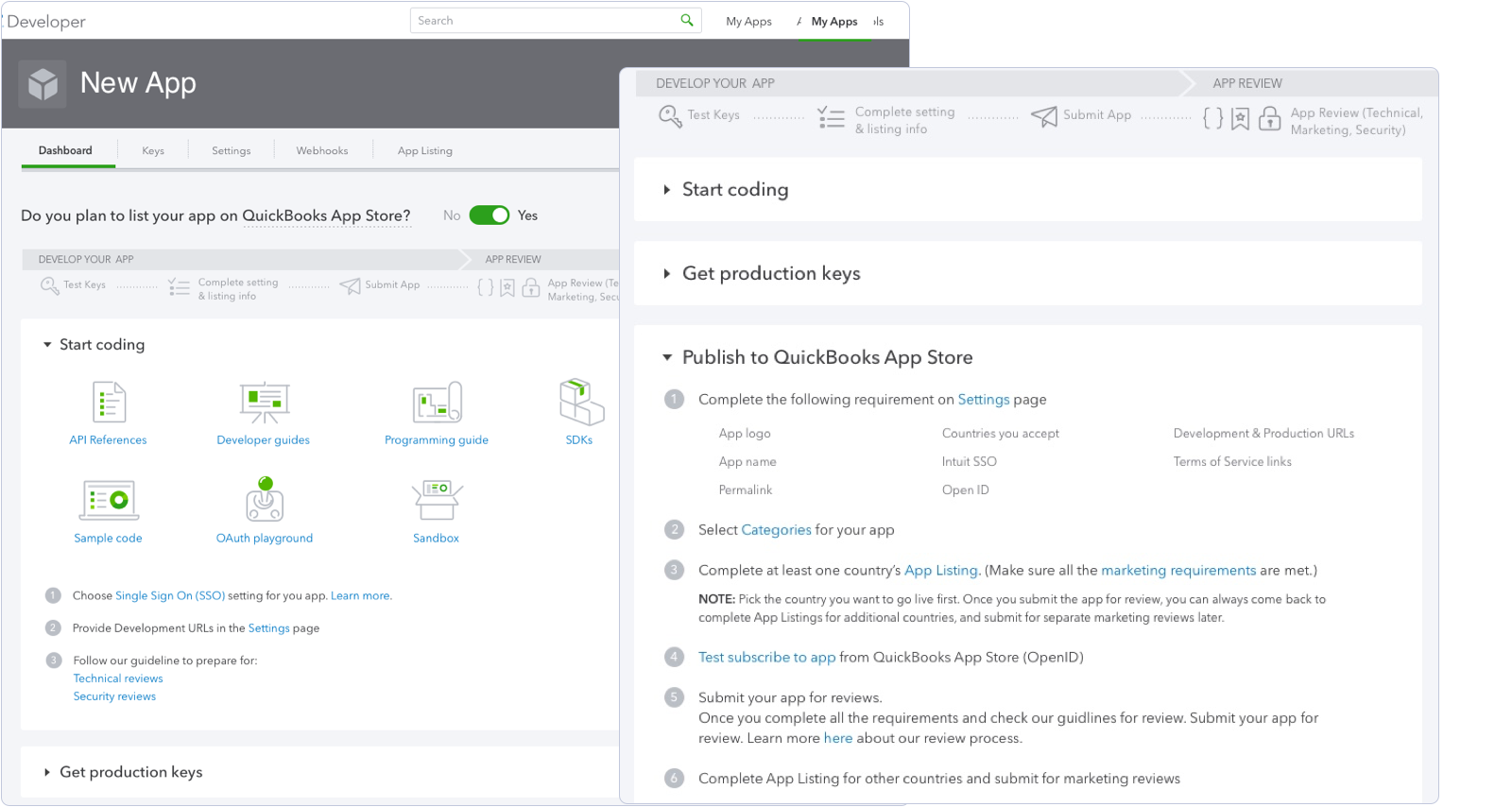
Developers always have guidance along the way so they won't feel lost. Besides the left navigation, the beginning of each page tells what developers need to complete before landing there. At the end of each page, there is a What's next section to suggest the next steps for developers.
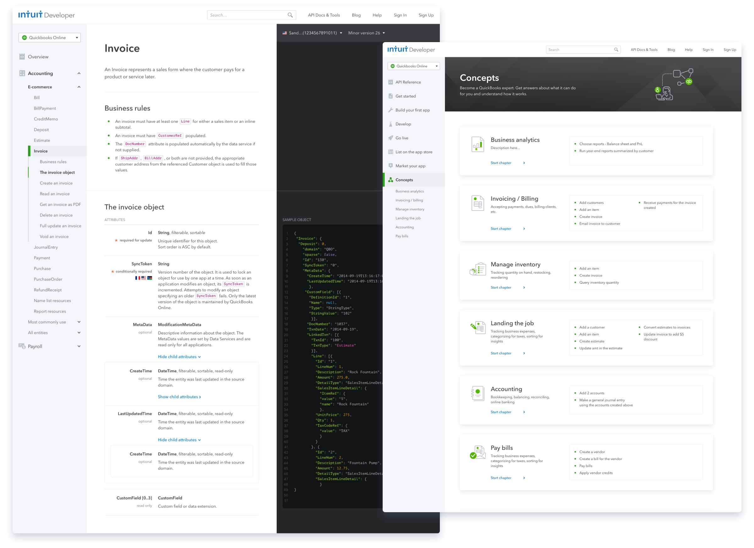
Learn and explore in one place
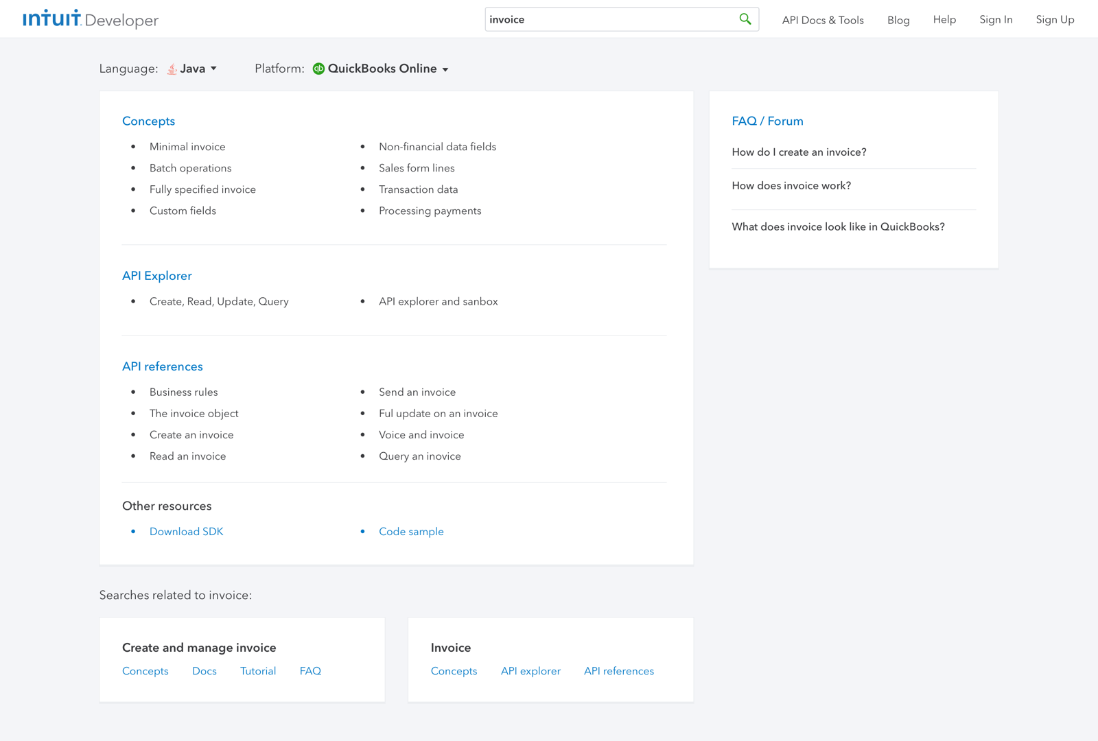
Developers can now read the API Reference and make the API call with the embedded API Explorer experience. They don’t have to click between tabs back and forth anymore.
In addition, they can learn more about the common accounting concepts to get familiar with QuickBooks.
How we got there
To validate all hypotheses from our D4D sprint, I created wireframe mocks and tested them with internal and externals developers. I then narrowed down the best direction to test on a larger scale with developers in Australia, England, Canada, India, and US.
You only get one chance to make the first impression
First Time Use is something we take very seriously at Intuit. The first time any persona lands on our home page, we wanted to make sure they could quickly get to the resources they need and easily navigate to the next steps.
We aimed to provide clear guidance to help developers get started. I wrote and designed multiple Get started doc versions to test what developers need to succeed. Then I passed the feedback to the technical writing team to help revise the page.
The home page gives a different starting point for each persona’s path. It tested very well and I was happy to see a good amount of developers completing the tasks they had in mind quickly.
Learning note: One thing we could improve was providing clearer content in some places to set the right expectation. We had to be careful with how we communicate because what one word meant to us could mean something different to other developers.
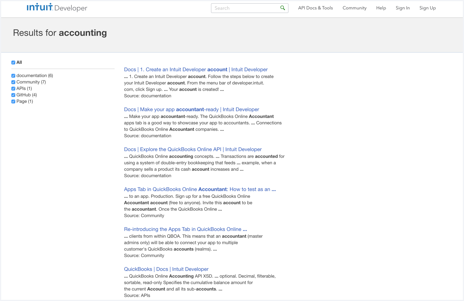
Left image: Old design, search result shows random matching links.
Right image: New design, categorized into 4 main contexts that are more relevant to keywords.
Trust and stigma
Besides the 4 quick access cards, Search was the idea to quickly take any persona to their desire destination since there were many possible ways to get started.
During user testing, only 12% of developers clicked on search or wanted to use the search. I learned that current developers had a huge stigma with our search due to the old one just gave dummy suggestions that weren’t helpful.
When I asked them to try the new Search concept, they loved how they could get to their answer within the first few interactions. At that point, I knew that in order for Search to be successful, we had to re-educate the users to overcome the stigma. Due to certain constraints, we couldn't release the ideal search experience in the early rollout.
Observation to innovation
The first common action for some developers is to go to API Explorer to test the API and go to API Reference to learn the instructions. Others may do the reverse. With the old design, developers needed to switch back and forth on API Explorer and API Reference.
Observing this behavior during a user test, I wondered why we didn’t combine them into one so developers can learn more in detail about the APIs as they test them.
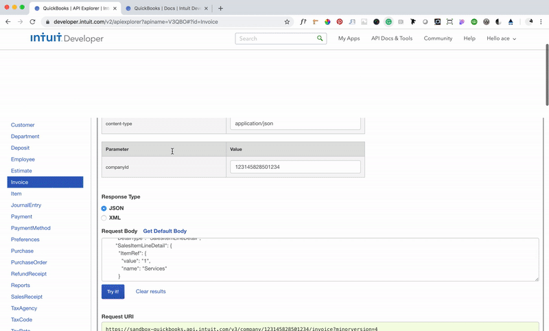
Old design where developers keep switch between tabs
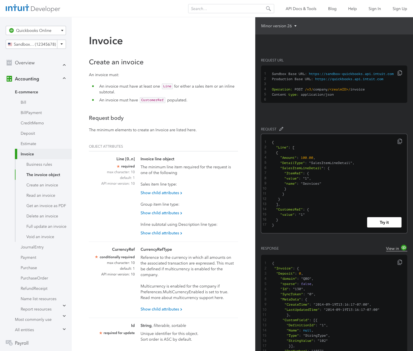
New design with both API reference and API explorer in one place
I tested the idea and share the feedback with stakeholders to show how this could help us improve the experience. Looking more into the data, I learned that less than 30% of developers used our API Explorer while 66% of visitors went to our API reference. This helped the design to be more documentation centric while still allow users to test the API as they go along.
From more user testing observation, I also created a visual feature that helped developers get more familiar with the product as they test the APIs. This feature got approved to be patented. Unfortunately, I cannot show this feature yet.
Every design decision matters
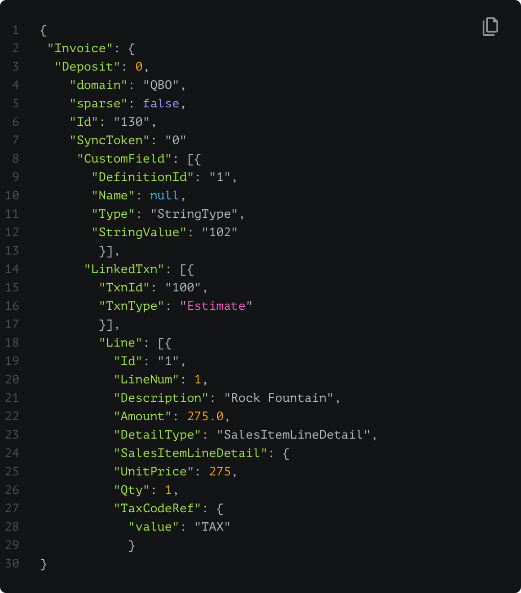
With so much text in one documentation, I wanted to help developers save time and get to the important content. For the code box, I worked with the technical PM to learn what developers read first in terms of hierarchy. Then I use colors intentionally and accessibly to highlight important ones.
Out of all the types in JSON (key, values, boolean, strings, numbers, enum), we want to emphasize numbers (0, 1, 275.0), boolean (true/false), and enum (Estimate). Each color is from the Intuit Brand color palate and tested for accessibility in terms of color contrast.
Scaling the visual
Since the product did not align with the Intuit branding guideline, with help from a QuickBooks Design System designer, we created our own design system to support all the platform’s needs.
The challenges
There were more than 1000 documentation pages (not including marketing and the logged-in portal). With 1.5 designer, we couldn’t design all these pages. The solution we had was to create a design system and documentation templates that work for all.
The platform had inconsistent branding. The homepage and logged in portal had QuickBooks branding while the documentation had the old Intuit branding.
Sample of the old design
Snapshot of visual components audit list
The solutions
My visual design partner, Jad Limcaco, and I did an audit of all the components on our platform and other developer platforms. We built out an inventory list of what we needed to create and how those look comparing to others. Then we use those components to create varieties of templates for different types of documentation and tested them.
This way the engineer team only needed to manually build 15 different distinguished pages as templates and migrates the rest of the documentation.
A few examples of template pages
Demo of switching product dropdown
For branding, we proposed a solution to have the blue Intuit branded homepage since it’s Intuit’s domain. For tools and resources pages, we will theme the brand base on the product they belong to. Although we currently only have QuickBooks resources, in the future we would support other Intuit’s product. The design we created would be flexible enough to do any theming.
The roll-out strategy
It took a whole team effort to make the new experience possible, especially having everyone aligned with the vision. The PM and I organized regular stakeholders standup where I shared out raw design draft and early user feedback to the team. We brainstormed and overcame the problems together.
As a team, we wanted to test and prove the potential success. We knew this project would take a while to roll out and there were small changes we could implement right away to get the early results.
Low effort - high impact
A big issue we had was a high amount of developers (20%) published their app to the app store without the intention of doing so. This caused by the dashboard was designed with the assumption of all developers need to publish their app to the app store. Some developers just want to use their app privately without having their app on the store.
A few user voice feedback of dashboard
Left image: Old dashboard design. Right image: New dashboard design
What we did:
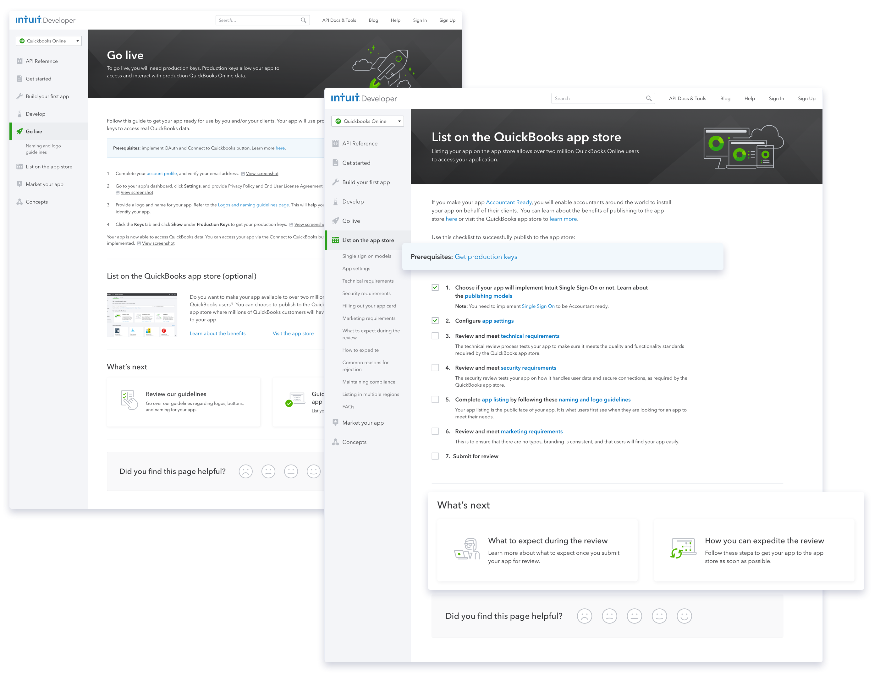
1. We refined our terminology. Instead of calling private apps vs. publish apps, we made it explicitly clear by using Go-Live (app can be used with real users) and List on the app store (apps want to be on the app store).
2. We updated the dashboard First Time Use to be very instruction focus. We gave developers clear steps to get to their goal which was getting their app to goes live. We called out that Listing to the app store is optional.
Low hanging fruit
One small change we did to improve the First Time Use experience was making our key resources accessible from any place in the platform. The simple fix was to implement the API tools & doc dropdown. We saw a huge improvement in our First Time Use PRS (Product Referred Score), up 16 points.
Pulse check along the journey
We created instrumented PRS checkpoints across the developer lifecycle throughout the platform that helped us to fix reported issues and bugs with velocity. This also gave us the confidence of understanding where developers were experiencing most delight and facing the most difficulty.
The impact
The first phase of the new platform launched at QuickBooks Connect 2018. Before the official launch, we had been rolling out low hanging fruit fixes and implemented small but critical features that helped move the needle in a few areas:
29
points increased in Net Promoter Score
36
points increased in Product Referral Score of the publishing experience
5%
of unintended listing to the app store, reduced from 20%. This helped reduce the support cost.
Reflection
I’m proud of this project, what I’ve accomplished professionally, and grown personally. Through strategic approach and collaboration, I was able to overcome different challenges in term of user experience, design as scale, technical knowledge, limited manpower and resources. Although there were a few designs that didn't get through development due to certain constraints, they were still great progress in the right direction.
This was a great example of how much design could make a positive impact on the business. For a long time, there wasn't a clear direction for everyone to be on the same page due to the lack of user empathy internally. Through research, user empathy exercises, Design for Delight workshops, and data digging, we were able to move forward together on a clearer path with a better understanding of our users. With the new experience, developers would fasten their app development and have more time to focus on building their business.
“Data shows us what happened and user research tells us why it happened”
Phew! Wasn't that a lot?
Thank you for visiting and looking through my project. If you would like to learn more in details, feel free to contact me.
Let's keep in touch
I aim to make this website as accessible as possible. Any suggestions are welcome.