Accessibility at Intuit has been making great progress due to the work of amazing accessibility champions around the company. At Intuit, we work to create products and services that everyone can use, no matter the level of their physical or cognitive ability.
Disclaimer: This write-up is from my personal journey perspective and does not necessarily reflect the views of Intuit. I have omitted confidential information and actual data.
Why accessibility?
Accessibility is a foundation of design. It simply means providing access for everyone. As UX or product designers, we tend to focus on usability first. If only the product is accessible then it's truly usable. Then we go deeper into inclusive design which is the process of finding out who or what is being excluded. Universal design is harder to achieve because the design has to work for everyone and in every situation.
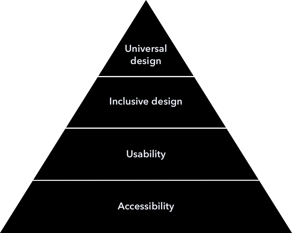
Design foundation pyramid
The road to impact
Picture of Intuit Accessibility Champions at the Bay Area A11y Meetup
I first joined Intuit on a fast-moving pace project where I needed to leverage the design system components and pre-existing designs which I had a lot of questions due to conflicts with my past experience of design patterns. Coming from an enterprise data security company where we created products for government and private sectors, so accessibility and usability were very critical to our products. My wonder got me on the journey of understanding and contribution to the improvement of the Intuit Design System. Things slowly became my mission to build accessibility at the design foundation through awareness, education, and collaboration.
My intention in sharing this story is to show that anyone can make a difference by turning their passion into action.
Early discovery
The state of accessibility
After expressing my passion to my director, I was included in the loop to help out on an initiative from the Intuit Accessibility team to do an audit for QuickBooks. I got to connect with the core Intuit Accessibility team which was a very small team with a strong engineering background. I learned about the great works they were doing and I discussed the areas of opportunities in the bigger picture.
If we look at the common product cycle flow from Research to Deployment:

Research

Design

Development & QA

Deployment
The Intuit Accessibility team mostly focused on product development to deployment parts due to the limited resources they had. Many accessibility bugs were caused by design. What if we could eliminate those design issues from the early stages and build accessibility at the foundation?
Current challenges
When I connected with more designers and met a few who have been advocating for accessibility, I learned that:
- Not every designer knew or understood the importance of accessibility
- Many designers, engineers, product managers had a prejudice about accessibility. (They think it’s something that can be added later on or may ruin the design aesthetic)
- No dedicated design resources to help educate and guide designers to this new knowledge.
- No bridge between designers and leaders to help prioritize and move the needle or challenge the design culture.
The plan
Baby steps
If we wanted to make our product more accessible, we need to help people understand the importance of accessibility, erase the stigma and make accessibility part of their day-to-day work. Our plan was to:
- Raise awareness (make sure everyone knows about accessibility and why it’s important).
- Educate people on how to design, develop, research, test, with accessibility.
- Provide guidance, resources, help them grow on their own.
- Let them be the champions of their own and inspire others.
An artwork from our Accessibility Champion Tshirt Design Contest by Ruolan Xia and Justin Li
Let's start the fire
Uniting the sparks
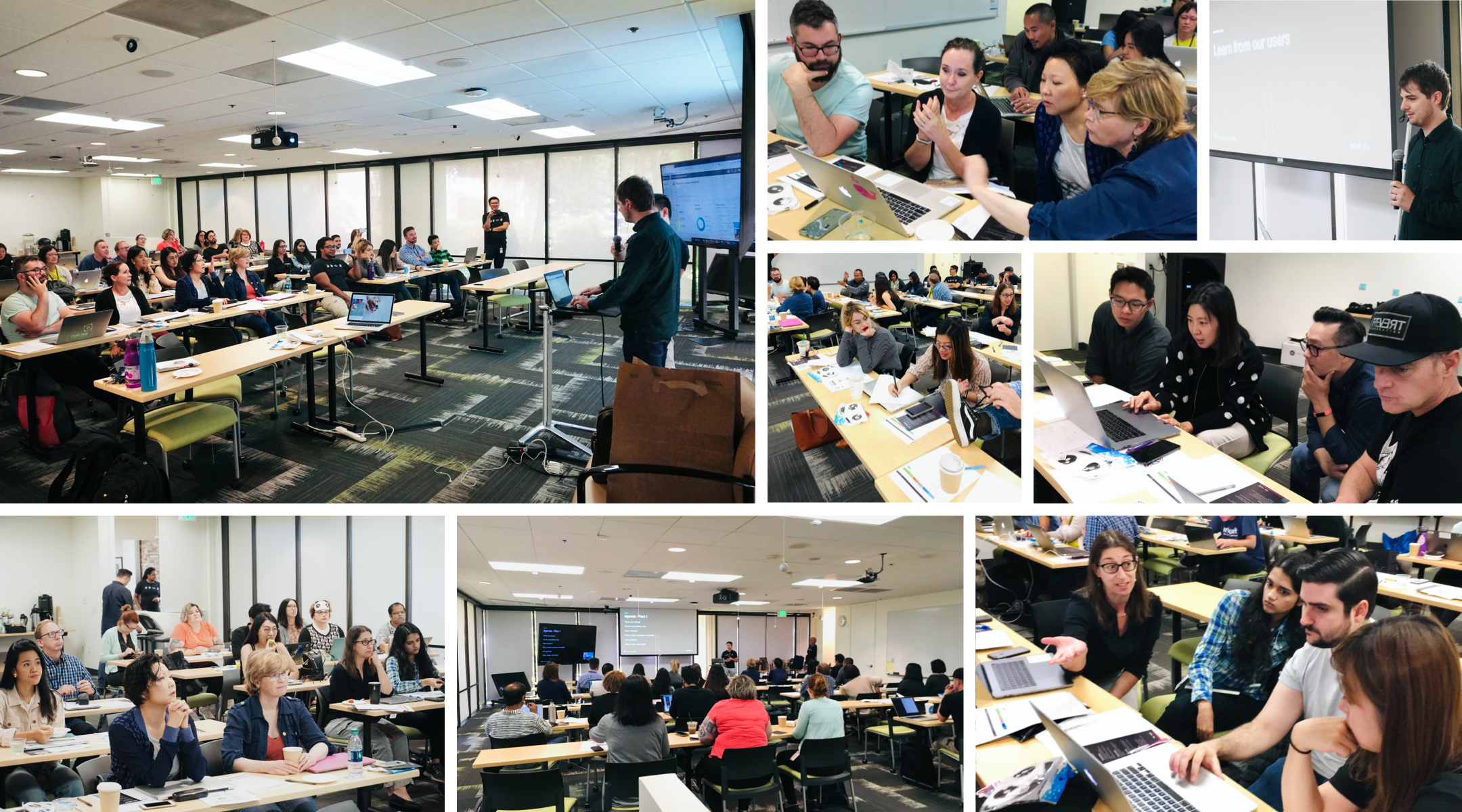
To raise awareness as scale, I wanted to create an event where all designers come together to bridge the gap of knowledge. I recruited a few great designers and accessibility advocates to join me on the quest. We set the event date to be during the Global Accessibility Awareness week which was in May. That gave us 3 months to prepare and enough time for the audit to be shared out at the event. This was an extra project for us on top of our busy day-to-day work. It was one of the most stressful times for me but the passion kept me on track.
To ensure the success of our event, I created and led multiple to-do lists from getting the budget approved to visual identity and creating learning materials. However, the most important part was to figure out how to tell a simple and effective story to spread awareness.
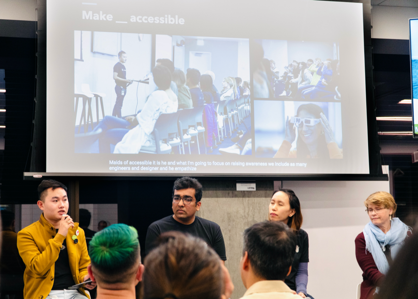
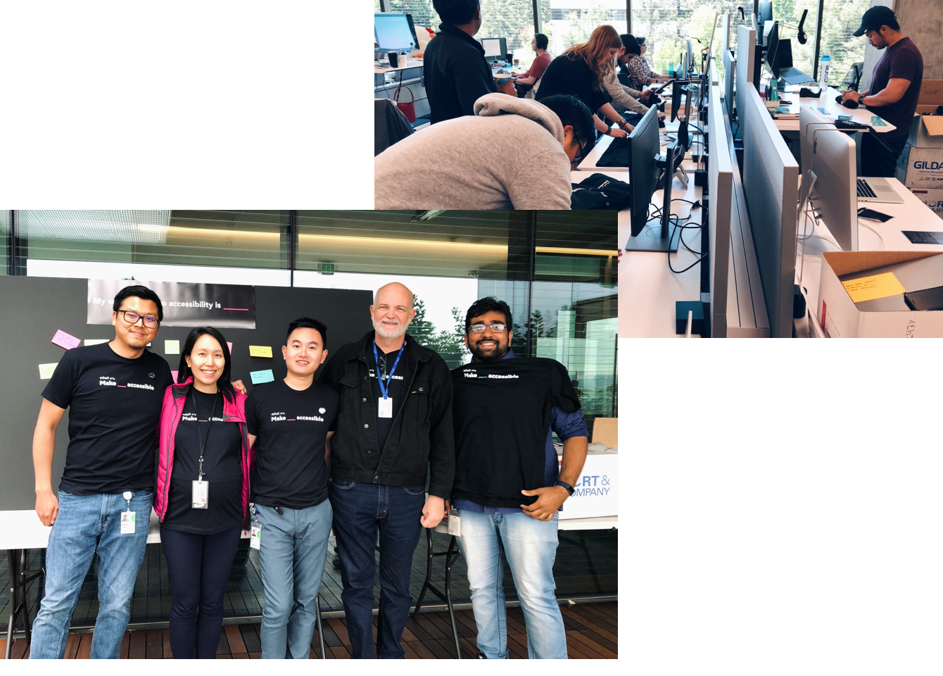
Make _ accessible
We named the event Make _ accessible as the call to action encouraging everyone that we can make anything accessible. More than hundreds of designers, engineers, and product managers attended the event onsite and online. They got to learn from users with disabilities, accessibility engineers, designers, and guests from other companies who have made great progress in the accessibility of their products.
From the feedback survey and post-event email, we were happy to see the success of the event. Many were excited to learn more about how they can apply accessibility in their work.
Materials and guidance
Before the event, we revamped the Design Accessibility website, carefully reviewed tools, curated recommendations, and created learning materials to help designers and engineers to start implementing accessibility in their day-to-day work.
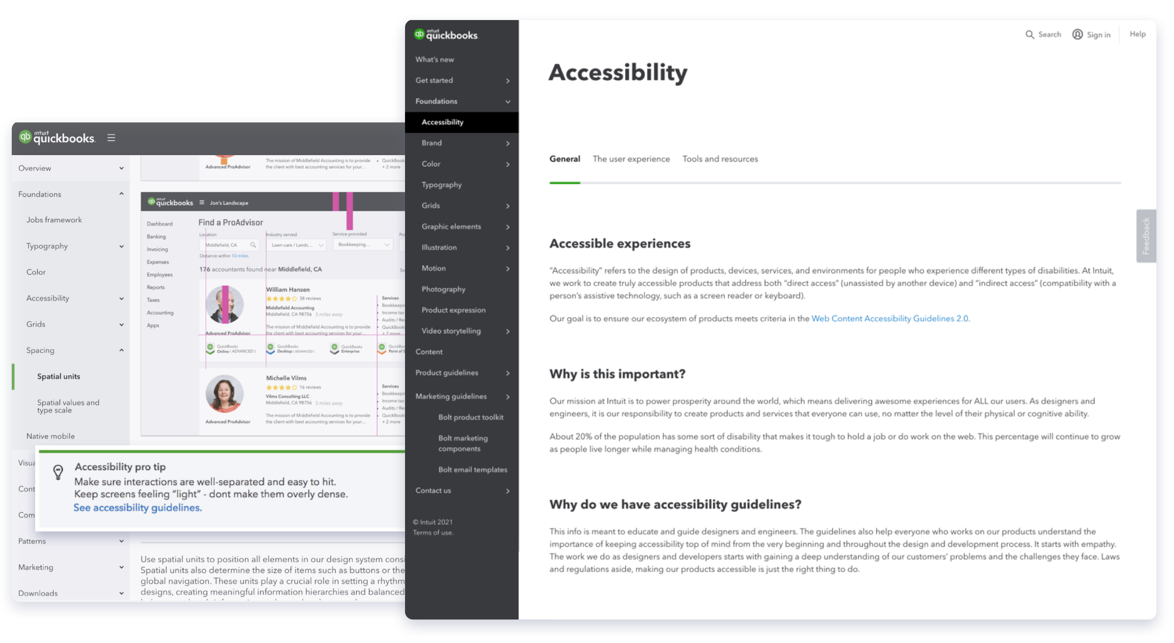
New accessibility website with curated resources, guidelines, and tips.
Check out the website
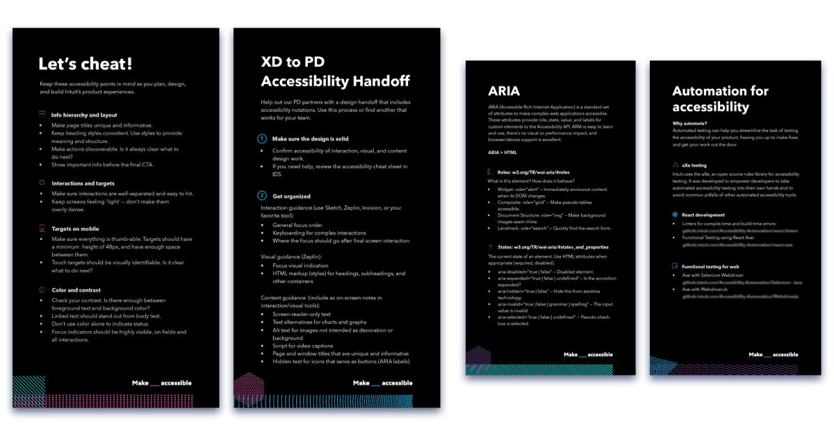
Cheat sheets for designers and engineers to guide them from design to product development.
You can view other resources and download these cheat sheets on the QuickBooks Design System Accessibility website
Data as fuel
After the Make _ accessible event, the QuickBooks accessibility audit report done by the third party came in, I went over hundreds of pages of issues and analyzed them into multiple categories to share out the results with the leadership and the design org. The report was against the key tasks of QuickBooks and the old Design System components.
From the description of each issue, I differentiated technical issues vs. design issues. Design issues mean they are caused by design decisions or lack of guidance from designers. The common theme ran across from visual, interaction, to content design. The Intuit Accessibility team and I imported all the issues into Jira with priority and goals to resolve them. While the core Accessibility team focused on the technical issues, I focused to resolve the design ones. To spread awareness, I went on a tour of presenting these data to each design team by leveraging their channels (emails, team meetings, brown bags, lunch and learn, etc...).
Please note these graphs do not reflect the actual data. They are meant to illustrate the process.

Estimated UX issues (caused by UX decision or lack of UX guidance) vs. technical issues.

Issues of the old QuickBooks Design System components broken down by content types

Issues of QuickBooks' key features broken down by content types
Impacting the foundation
Crossing the threshold
Based on the accessibility audit report, half of the issues were from the design system, and the other half was from designers' decisions. Besides training designers to better equip them for design decision, an important change I needed to make was improving the design system components which all designers were using. This could cut the issues we had in half and help make our products more accessible.
I made the case to the leadership for me to transfer to the Design System team. At that time, the QuickBooks Design system was the most mature one out of all the design systems. Intuit Design System was still in the early stage of establishing by leveraging the work from QuickBooks. QuickBooks was also going through a design visual refresh which made it the perfect opportunity for the needed updates.
Moving the needle
Once I was part of the design system, my goal was to influence with action and evidence. I started by auditing in detail all the components we had based on the third-party report with linked references to WCAG 2.1 and trusted case studies. Along with the QuickBooks Design System, I was also auditing the Intuit Design System as they are parent and child with Intuit Design System as the codebase. Each issue was discussed one by one to help both teams understand the basics and how we can improve them as a system.
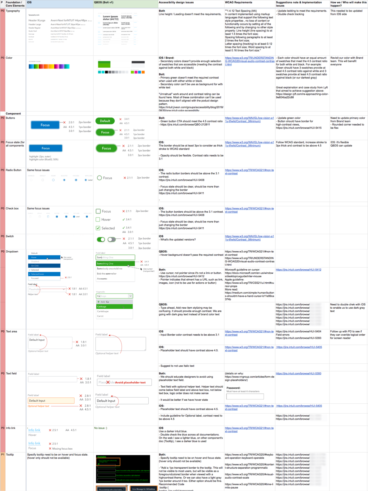
Snapshot of a few examples in my design audit list
Design with intention, every detail matters
It was a great opportunity for us to look at everything in the smallest detail. From line-height, stroke weight, states of hover, focused, pressed, navigation, dropdown, to buttons, every visual and interaction decision must have a strong intention of making the design system more accessible at a high standard. Because we are the design system, each change from the smallest detail has to be thoroughly tested by multiple designers in their areas of QuickBooks.
One of the exploration Lishuan Lee and I worked on
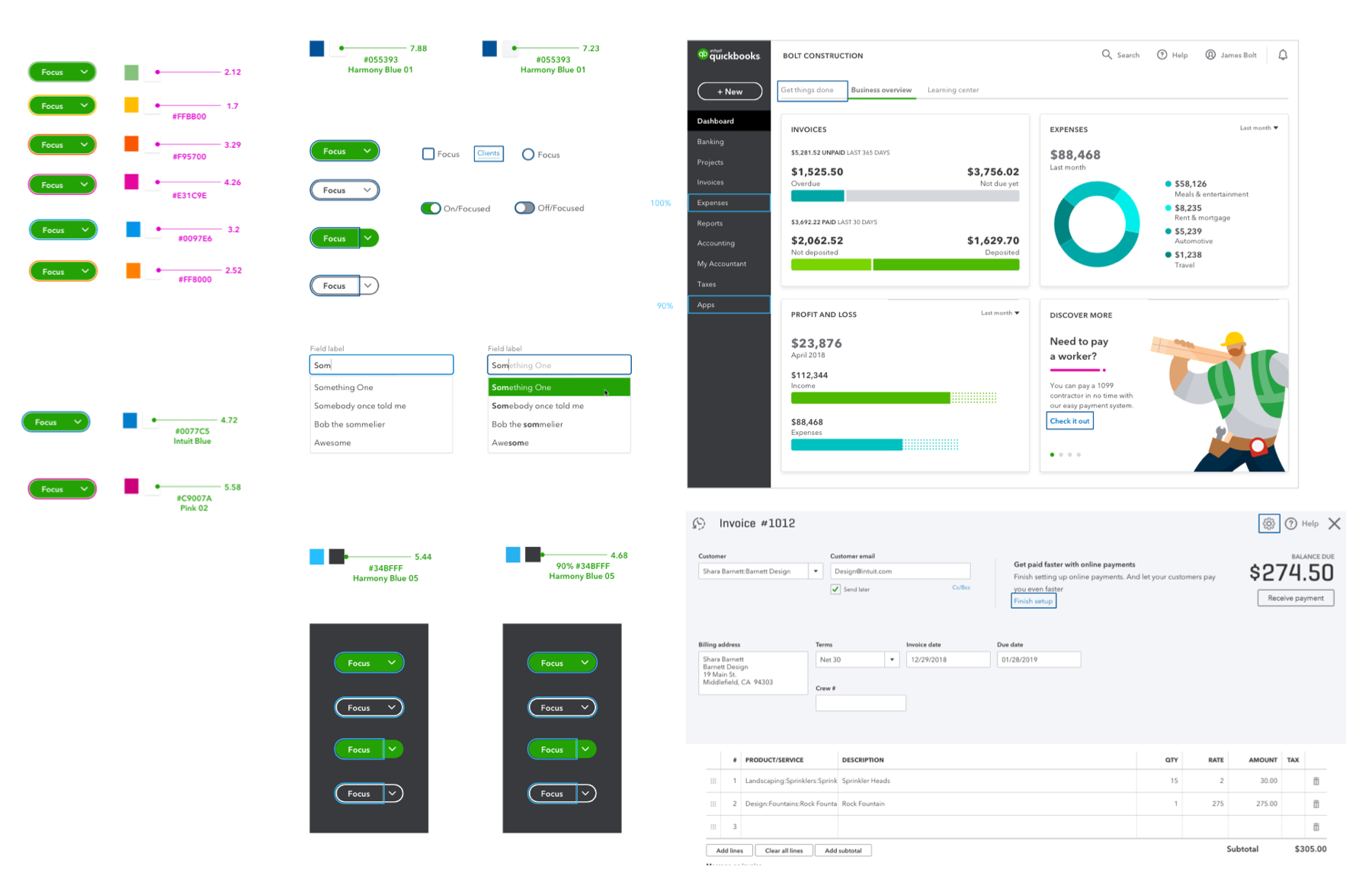
For example, our focus indicator for the focus state of most elements needed to be updated to meet the WCAG 2.1 criteria of at least 2px stroke with a 3:1 contrast ratio.
Besides testing on product areas with background, we also needed to consider areas where components are placed on gray or dark backgrounds.
Another example of a design pitfall is designers tend to use color alone as an indicator for status, changes, etc... Many weren't aware of color-blind users who wouldn't be able to tell the difference between green (active) vs. gray (inactive). To them, both colors are almost the same.
To solve this we experimented with different designs and also included guidance for designers to always use indicating color with the contextual label.

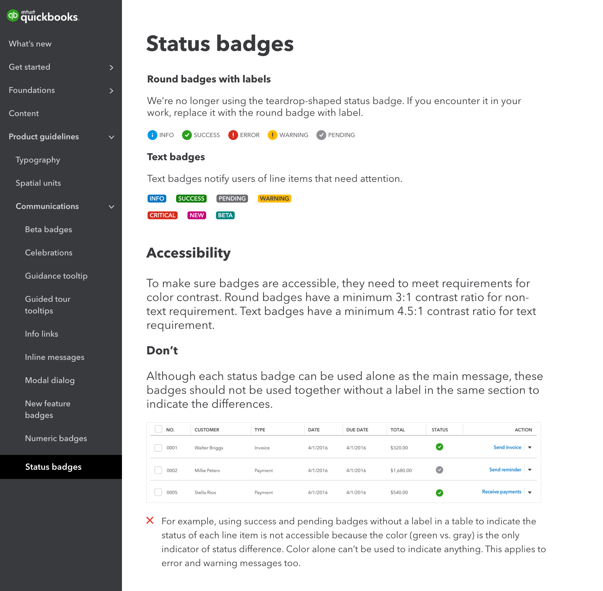
Screenshot of the Status badges page in QuickBooks Design System website that shows accessibility guidelines to help designers avoid the pitfall.
Results
Once we have the changes, we worked closely with the Intuit Design System engineer team to implement each change with an intensive review and testing process as these are the core components that would be used across all Intuit products. Accessibility became a key part of the reviews committee where the Head of Intuit Accessibility, Ted Drake, and I would be reviewing them in different areas of accessibility.
The only thing on the issues list we couldn’t update right away was the brand green color because it involved multiple teams with bigger discussion. We noted all the issues with our color, documented feedback, and created a separate partnership track to update them. I was supposed to lead this initiative but I was leaving Intuit for my personal research journey at that time.

A few examples of the before and after changes
Keeping the fire up
While I was working in the Design System team, I also wanted to continue our progress in raising awareness. After the Make_accessible event, many people were hungry for more. They wanted to get more education as Accessibility can be a very big knowledge space and overwhelm for people who are not familiar with it.
The Intuit Accessibility team already had onboarding and training in place for engineers, but there weren’t any for designers. I looked at the materials out there, but most of them only covered the general ideas. There weren't many companies that have dedicated accessibility design training.
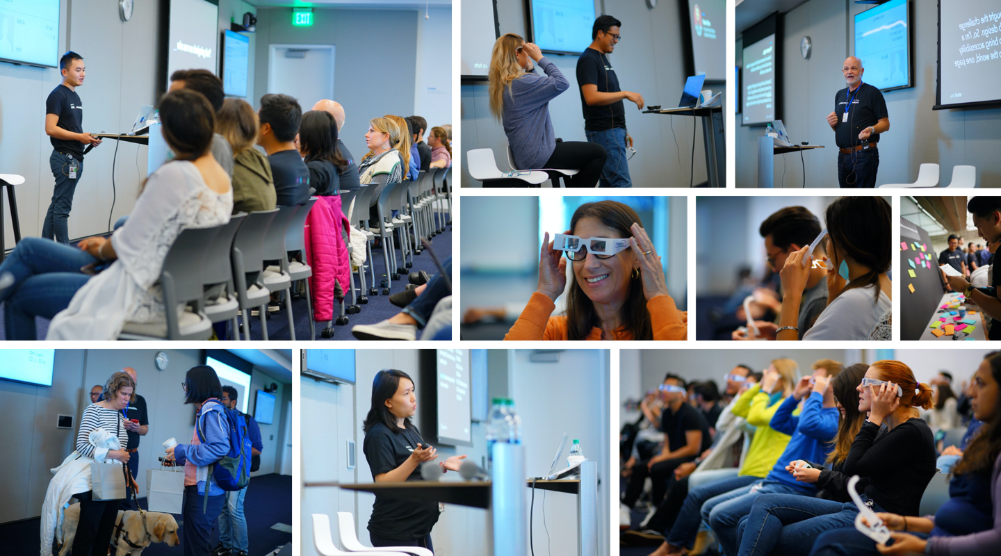
With some help from other advocates, I created a unique accessibility design training specifically for designers as we understand both design and accessibility perspectives. I didn’t want to create a typical training where people just sit and listen. The audience would forget everything once they got out of the room. I wanted to create an immersive day where everyone could put themselves in the user’s shoes, learn, practice, and apply new knowledge into their design workflow.
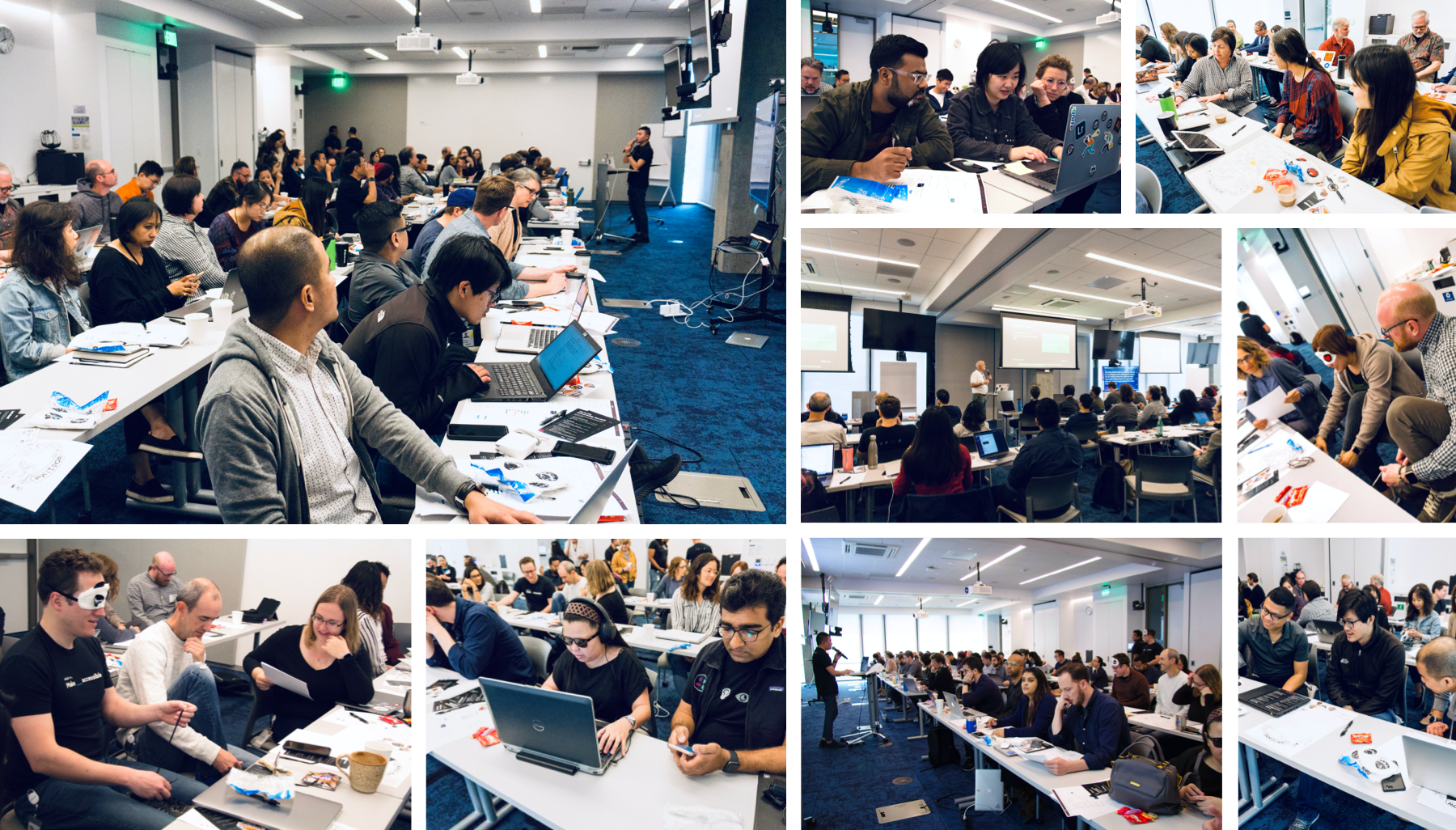
Design training
The training consisted of curated materials that covered the whole design workflow from research, interaction, visual, content, and design with accessibility. Designers got the opportunity to observe and interview our users with disabilities who use our products.
Working as a group, they practiced identifying the common design pitfalls and fix them. They learned how to hand over their design to engineers and how to test engineers' build for accessibility. The goal was to prepare designers to work with an accessibility mindset from the early stage to the end of the product flow.
Why did designers go through the training as groups? Accessibility can be overwhelmed for people and we didn't want to create a bad first-time impression where participants feel like they wanted to give up. We wanted to set an environment where they felt supported and not afraid to ask for help from their group members or other facilitators.
Accessibility Design Training
The second part of the training was the field trip where designers got to visit the Magical Bridge playground that was designed for all children regarding their abilities.
We got a VIP tour with the founder and the architect designer of Magical Bridge playground to learn about the mission and intention behind every design decision.
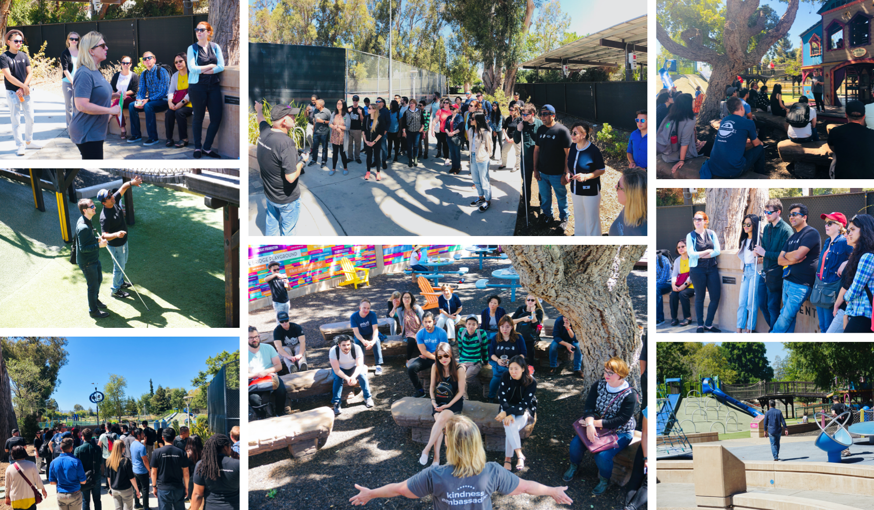
Olenka Villarreal, founder of Magical Bridge Playground, giving designers a tour around different spots of the playground and unpacking accessibility design decisions for all children.
Learning note:
To help us understand what went well and where we could improve, we had post-training survey feedback for suggestions. It was interesting to learn how much people loved the user interview segment where they could observe how users with disabilities used our products. We knew that having a user onsite is a critical part of our training.
Spreading the light
After the success of the design training in Mountain View, we received many requests from teams in different locations to bring our design training there. We went on a design training tour, brought the training to San Diego, Plato, Bangalore, Edmonton, London,…
For some locations, it was not possible to do the full version with the field trip, the user onsite, or have the whole team there. Thus, we created multiple versions of the training that worked in different situations. The goal was to give designers the critical knowledge and tools to be successful in designing with accessibility.
Externally, we also got a lot of interest in sharing this design training format out. In some trainings, I invited a few accessibility experts and designers from other companies as participants to exchange knowledge. It was not often to see a design accessibility training that was created for designers and by designers.
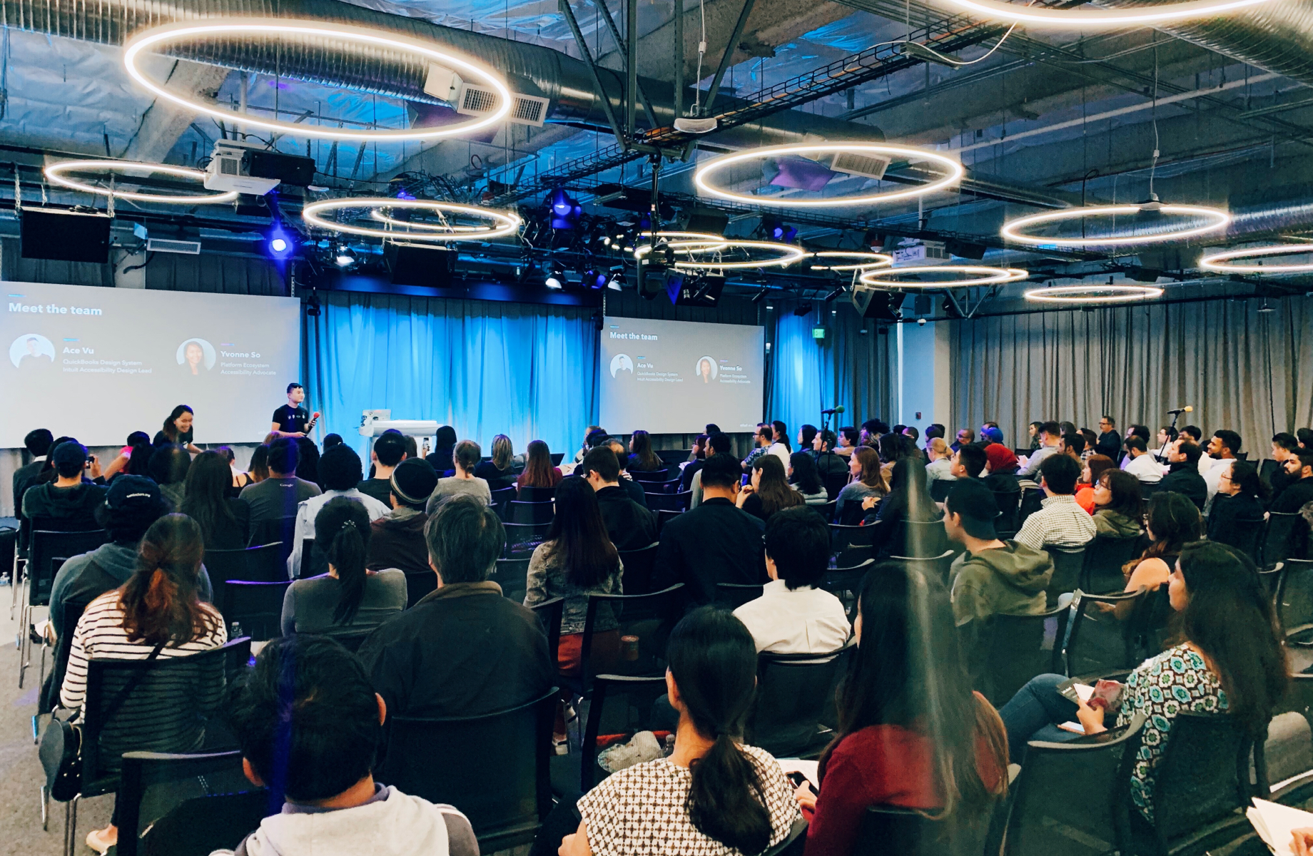
To share this training on a larger scale, I brought the mini version of the training to the South Bay UX Meetup where more than 400 people attended onsite and online. The reason why I’m passionate about sharing this knowledge because I wish I learned it when I was in school. It would have helped me be more aware of all types of users and have stronger intentions in my design decisions.
The public mini-training version can be viewed on Slideshare.
Ace at the South Bay UX Meetup
Million sparks
While the updates to the design system being implemented, the Intuit Accessibility team and I wanted to create more advocates across different teams. Leveraging the Accessibility Design Training Tour, we launched the Accessibility Champion program to create a strong support network that encourages everyone to start implementing accessibility into their day-to-day life. The program has 3 levels with a list of criteria where one is required to complete.
You can learn more in detail about the recently updated requirements through this Slideshare from Ted Drake.
Within one year of launching the program, we had more than 400 champions in 17 locations across the globe from 60+ roles. A large percentage of that was from the 250 designers we trained in our design training.
To keep the community engaged, we created a few initiatives such as monthly lunch and learn, field trips to other companies, design contests, and monthly email updates.
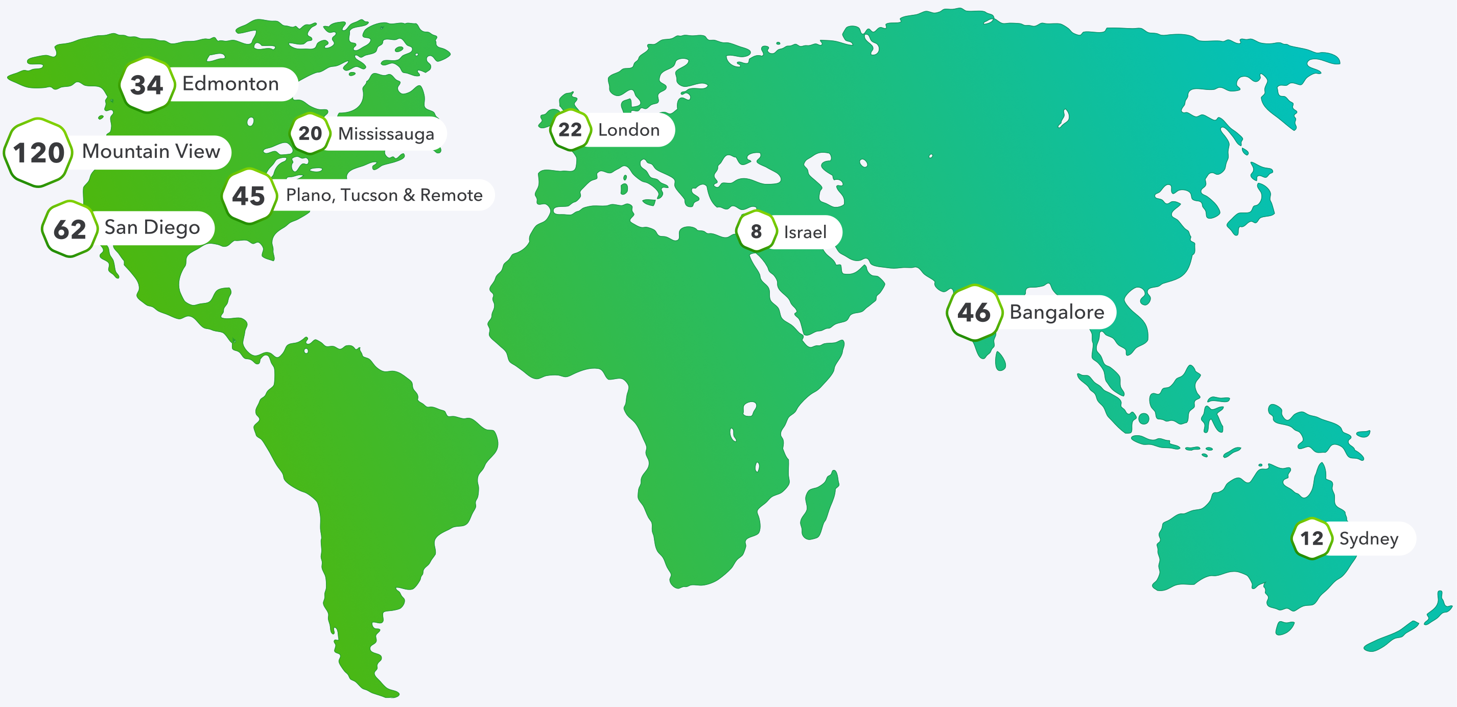
Sample map of Accessibility Champion around the world in different Intuit locations
Impact
45+
components were updated
92%
accessibility design reported issues were fixed
1000+
designers were trained internally and externally
From the moment I started this journey till now, I never thought I would have made the impact that I did on the design culture and accessibility at Intuit. My intention was to help more people be aware of our privileges and power. We should be mindful and think of everyone or at least for our future selves. We all are going to have certain disabilities, whether they are situational or permanents. I’m proud of the changes I have helped in the improvement of the updated QuickBooks and Intuit Design System.
Reflection
During my journey, I've learned so much about creating impact in a big organization where there were many layers and organizational challenges. I learned to have different strategies and storytelling techniques for different levels and target audiences.
Most importantly, I feel fortunate to have the opportunity to work with amazing humans who have taught and inspired me to be the person I am today. Many of these people have become my long-life friends. Nothing would have been accomplished without the passion, support, and encouragement from these friends. I want to express my deepest gratitude to all the wonderful champions and advocates.
Intuit Accessibility team at CSUN 2019
Intuit Accessibility
Ted Drake
Sagar Barbhaya
Poonam Tathavadkar
Cheryl Aranha
Sarah Margolis-Greenbaum
Make _ accessible
Yvonne So
Louise Mintun
Steven Chen
Jad Limcaco
Jonathan Shariat
Juan J. Marquez
Shawn Mosley
One spark can start a fire but it takes many to keep it alive
Beyond the light
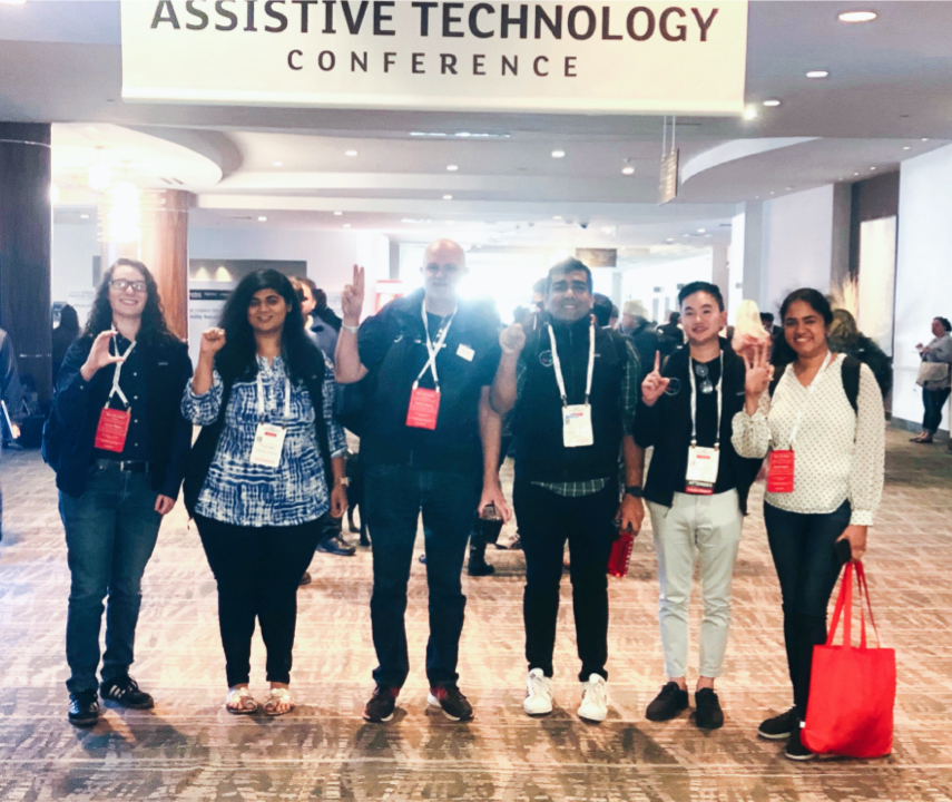
After making progress with accessibility at Intuit, I went on my sabbatical-personal inclusive design research in other countries where people with disabilities are seen as society's baggage and women are still viewed as social objects. I want to meet these people, learn their stories, document their struggles, and hope to use my voice as help in some ways. As I’m experiencing myself in new cultures, every day is an amazing day meeting all these strong individuals who inspire me to grow more compassionately.
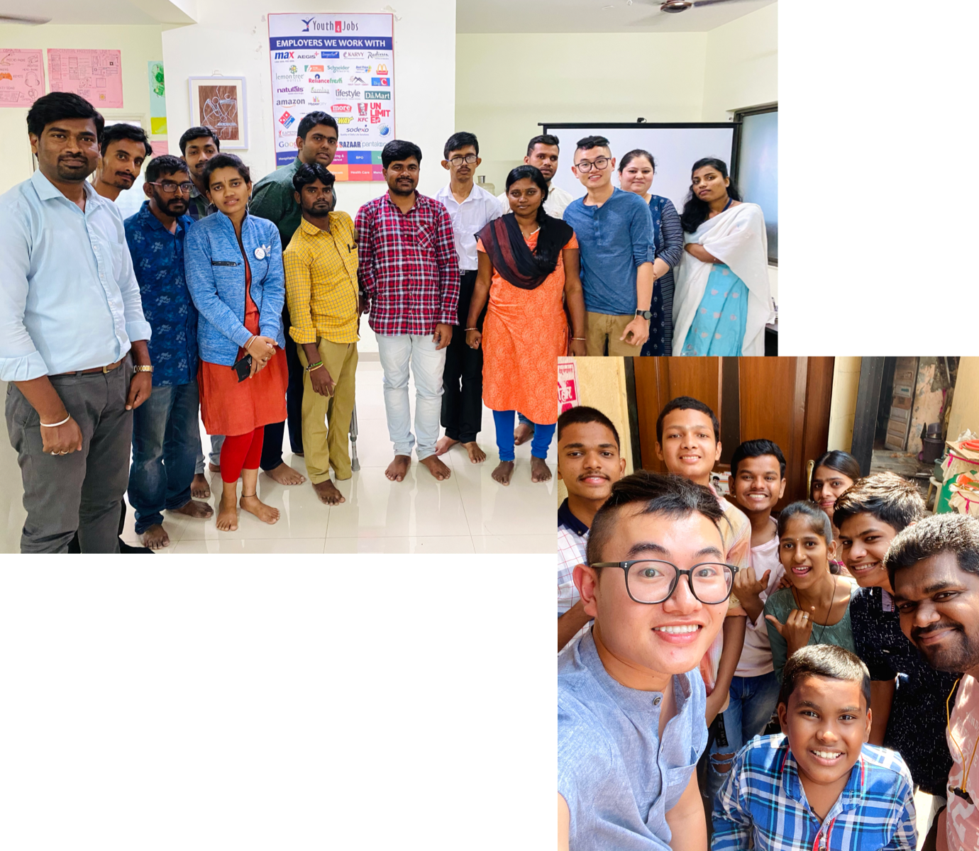
Pictures of Ace and people he met in India at Youth4Jobs in Bangalore and Project Differently-Abled Children in Mumbai.
It doesn't end here
Thank you for following my journey story till here. If you would like to learn more in detail regarding the design training or how to incorporate accessibility into your design culture, feel free to let me know. I'm happy to help in any way.
Let's keep in touch
I aim to make this website as accessible as possible. Any suggestions are welcome.